
Case Study
On The Dot™
a storage unit made just for women by women
On the Dot™ evolved over time, beginning with brand strategy and naming, through identity, packaging development, and design consultation.
SERVICES PROVIDED
- Brand Strategy
- Naming
- Brand Identity
- Packaging Design
- Design Consultation
COMPANY PROFILE
On The Dot™ saw the potential to solve a storage problem women face everywhere—how to keep products close at hand without sacrificing discretion or compromising decorative appeal.
insight
Created by a mother and daughter team that wanted to expand their idea from their personal home use to a retail space.
task
Come up with a name for the product based upon personalities and needs of women across many ages. Develop the brand identity, package design, and initial prototypes. Work with closely with overseas printers to ensure quality aligned with design aesthetics.
Solution
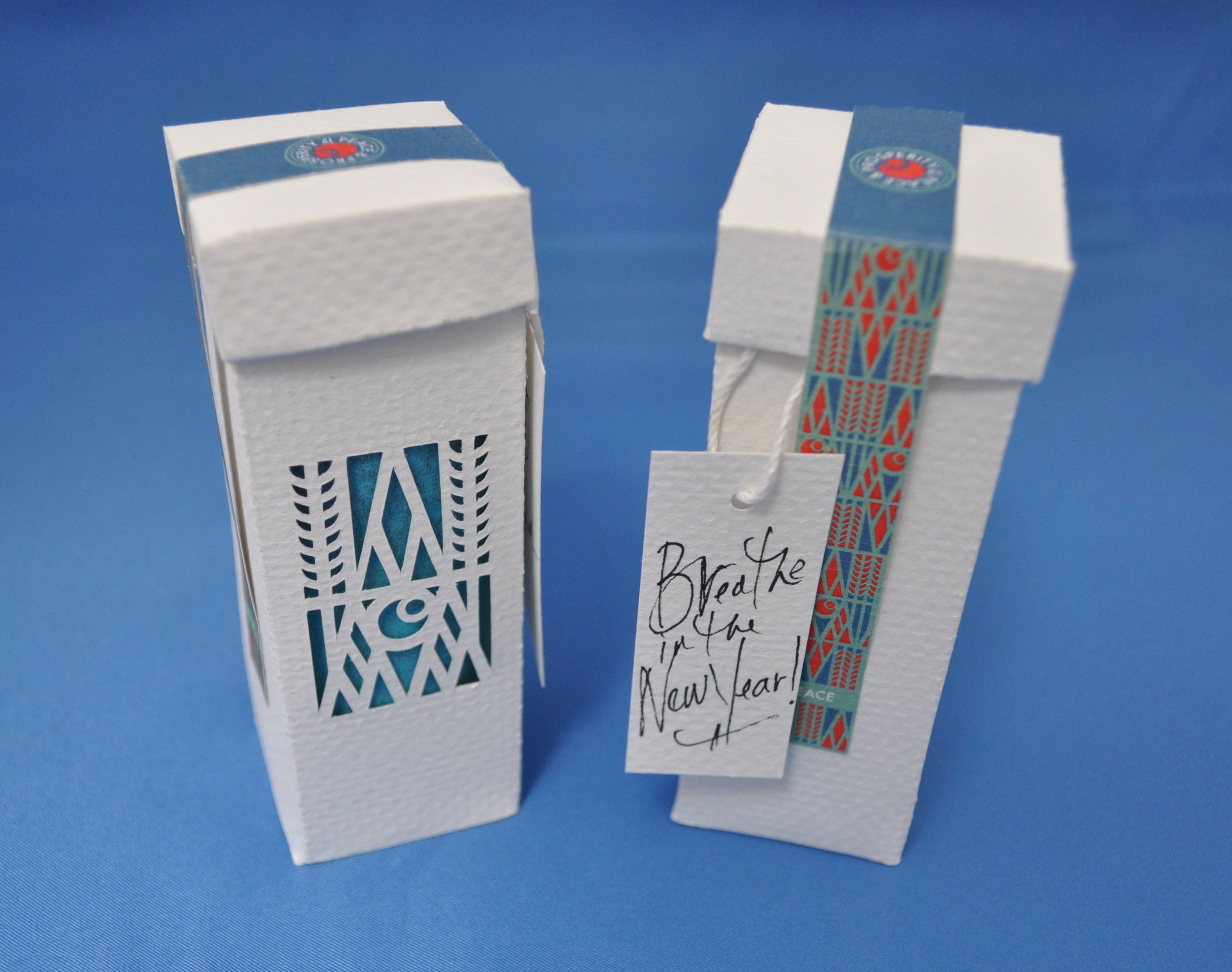
“On the dot.” is a play on the word, “Period” a term often used for a woman’s menstrual cycle. Combined with the tagline, The perfect spot (a reference to the hidden storage component) it becomes a friendly and playful brand name. The brand celebrates the confident women, one who isn't going to let her period cramp her style.
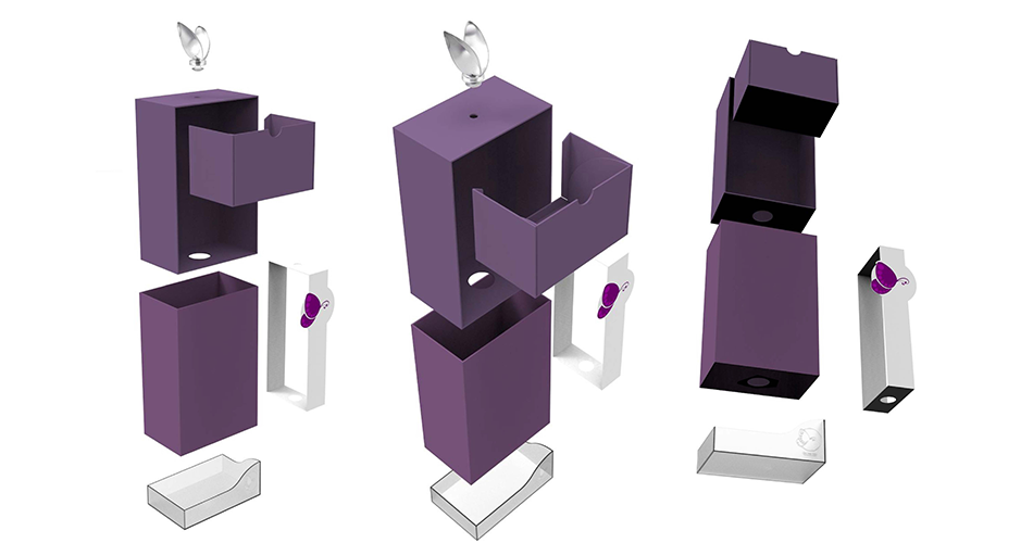
Three storage units where designed for the kickoff of the project. Each with their own personality.
DELIVERABLES:
Naming and tagline, logo design, brand identity package, brand strategy and design consultation, packaging prototypes, and three different design styles/illustrations to choose from.