Vanport Mosaic Festival
BRANDING & WEBSITE DESIGN
Vanport Mosaic is a group dedicated to preserving the stories and people of Vanport—Portland’s forgotten city. We have designed their event graphics since 2016.
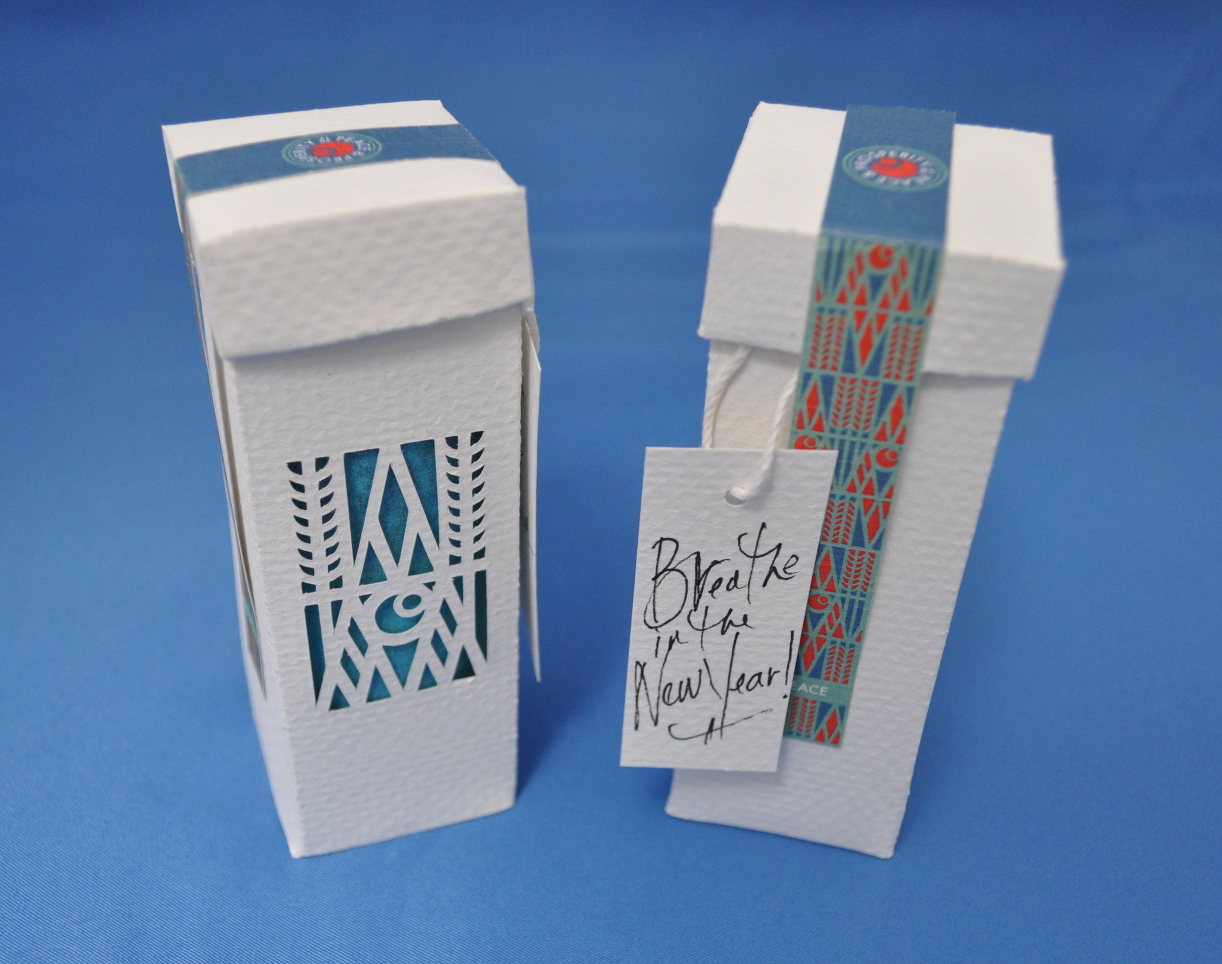
The brand is the face of the festival and is intended to engage a multi-facetted audience. To showcase the history and celebration of the work, the logo mark is interpreted in a variety of ways. The shapes represent a diverse community—people raising their hands in solidarity. They also represent the roofs over their heads and the walls that once housed the city itself.
A mosaic of color—powerful, bold, and approachable.
DELIVERABES:
Logo design, sign design, print collateral, copywriting and site design and build.


